4Cs of Effective Product Design

The 4C Framework: My Secret Weapon
Before we dive in, let me introduce you to the framework that's both my superpower and sometimes my team's playful nemesis - the 4C Framework. It's my go-to approach for everything from simple forms to complex design systems.
1. Context is King
2. Clarity Creates Confidence
3. Consistency Builds Trust
4. Confirmation Provides Comfort
CRUD: Making it Less Crude
Let's start with the basics - CRUD operations. Here's how I apply the 4C Framework to make them shine:
Create: Making First Impressions Count
Example Patterns:
Read: Information at a Glance
Context: What information matters most?
Clarity: Scannable layouts
Consistency: Predictable data presentation
Confirmation: Loading and empty states
View Options:
Update: Smooth Changes
Context: Minor tweak or major change?
Clarity: What's editable and how?
Consistency: Similar editing patterns
Confirmation: Save states and history
Patterns:
Delete: Safety First
Context: Reversible or permanent?
Clarity: Clear consequences
Consistency: Similar safety measures
Confirmation: Undo options
The Edge Case Detective Story
Now, here's where it gets interesting (and where my UX team starts rolling their eyes). I have this natural tendency to find edge cases - it's like my design superpower that sometimes feels like a supervillain origin story to my team.
Why My Team "Loves to Hate" My Edge Cases
Context Edge Cases:
Clarity Edge Cases:
Consistency Edge Cases:
Confirmation Edge Cases:
Scaling Up: Design Systems and Component Libraries
Here's where the 4C Framework really shines - it scales beautifully from CRUD to complete design systems.
Component Context Layer
States: Default, hover, active, disabled Themes: Light, dark, custom Environments: Desktop, mobile, tablet Containers: Cards, sidebars, modals
Component Clarity Layer
API: Clear prop names Documentation: Usage guidelines Examples: Implementation patterns Boundaries: Clear limitations
Component Consistency Layer
Visual: Spacing, colors, typography Behavior: Interactions, keyboard nav Patterns: Common solutions Standards: Best practices
Component Confirmation Layer
Developer: Error messages, type checking User: Visual feedback, transitions States: Loading, error handling Testing: Unit, integration, visual
Edge Cases in Design Systems
Component Level
Text overflow scenarios Extreme screen sizes Failed nested components Network instability handling
Integration Level
Component interactions State management conflicts Animation queuing Focus management
Implementation Level
Prop conflict resolution Missing context handling Deprecation strategies Backward compatibility
Tips for Implementation
For CRUD Design:
Start with user flows
Map out edge cases
Design for scalability
Test extensively
For Design Systems:
Document everything
Build in layers
Test thoroughly
Plan for growth
The Payoff
Yes, this approach means:
Longer planning phases
More detailed reviews
Extensive documentation
Comprehensive testing
But it results in:
Fewer production bugs
Easier maintenance
Better developer experience
Happier end users
Final Thoughts
Whether you're designing a simple form or building a complex design system, the 4C Framework helps catch issues before they become problems. Yes, your team might groan when you ask "but what if..." for the hundredth time, but they'll thank you when those edge cases show up in production.
Remember: Good design is invisible - users only notice it when it's broken. Our job is to make sure they never notice.
P.S. Always bring cookies to long review sessions. Trust me on this one! 🍪
Stay curious, keep asking questions, and never stop looking for those edge cases. Your users will thank you (even if your team occasionally wants to hide from you)! ✨

Navigation:
Don't Make Me Think Good navigation is like a well-designed city - you always know where you're going, even if it's your first time there. The best SaaS products make you feel like you've been using them forever, even when you're just getting started.

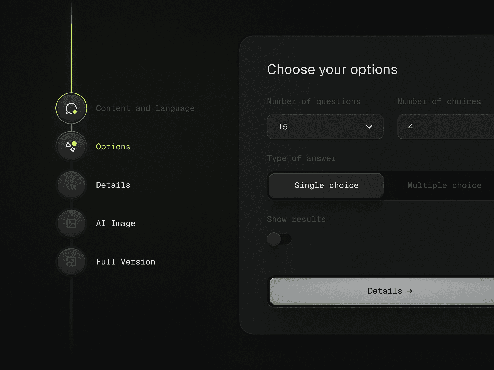
Multi-step forms / Wizards:
Your Friendly Guide Remember those "Choose Your Own Adventure" books? Wizards are kind of like that, but for getting stuff done. They break down complex tasks into bite-sized pieces, making even the most daunting setups feel like a breeze.
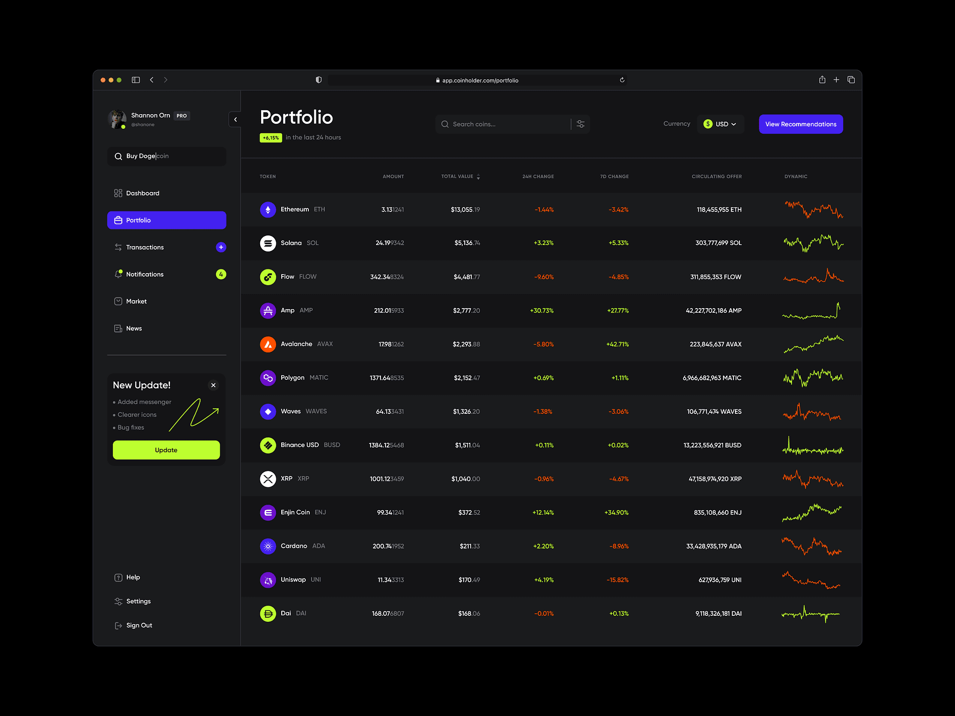
Data Tables & Filtering:
Finding Needles in Haystacks Nobody likes staring at endless rows of data. Good filtering is like having a super-smart assistant who knows exactly what you're looking for and can find it in seconds.`
Form / Logic Builders:
Playing with LEGO These are like digital LEGO blocks for grown-ups. They let you build complex workflows by simply connecting the dots - no coding required! It's amazing how powerful they can be while staying surprisingly simple to use.

Rich Text Editor / WYSIWYG Editors:
What You See is What You Get Remember the days of writing code just to make text bold? Yeah, me neither. These editors let you create beautiful content as easily as writing a document, but with all the bells and whistles you need.

That's a wrap! I'd love to hear your thoughts and experiences with these patterns. What SaaS designs have you fallen in love with? Which ones drive you crazy? Drop your stories in the comments!
P.S. This is just the tip of the iceberg - the SaaS world is constantly evolving with new and exciting patterns. Stay curious, and keep an eye out for more design insights coming your way! 🚀
Images: From the internet (mostly from Dribbble)